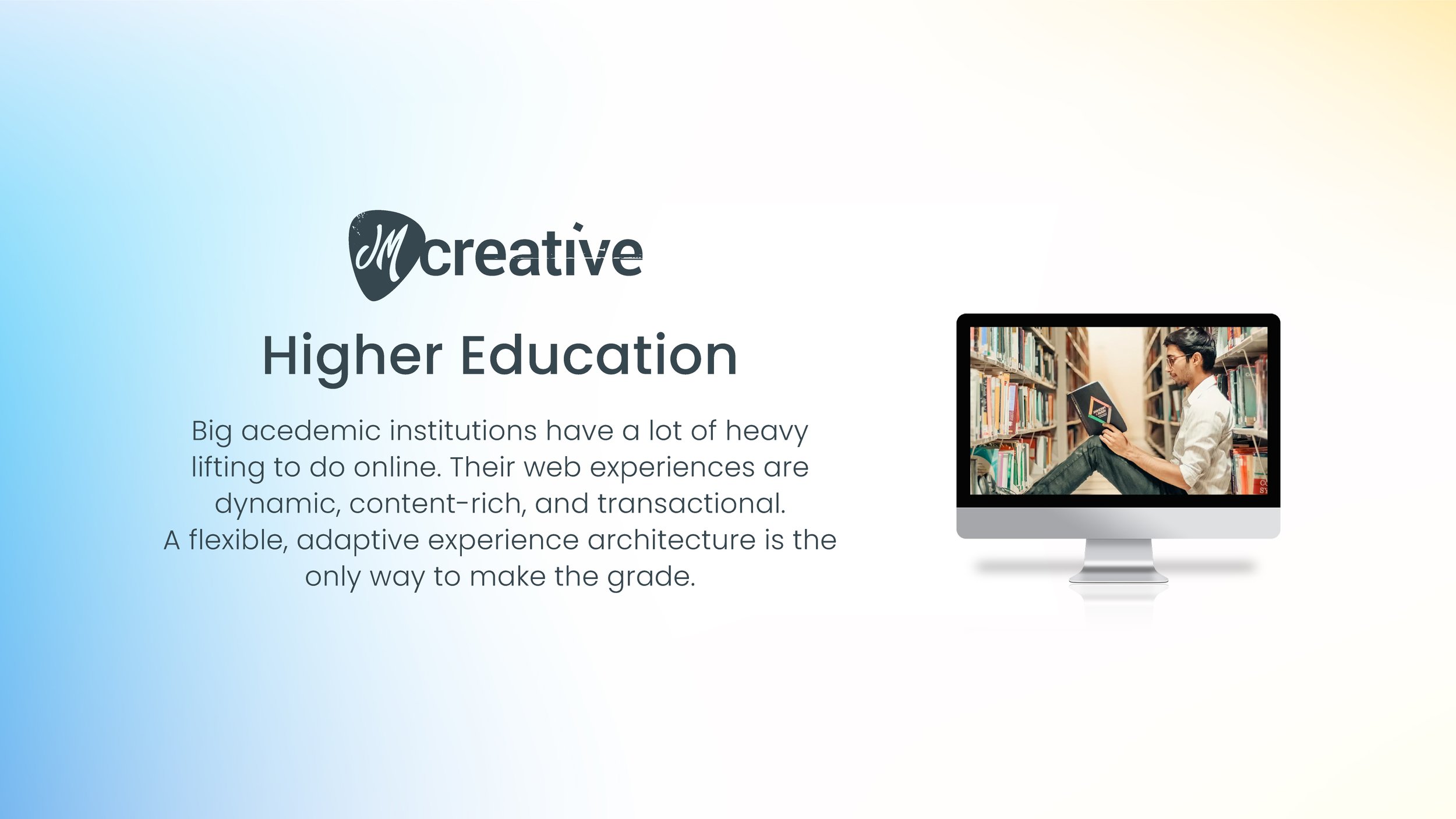
Project Types
Adaptive Website & Content Design
Role
Consulting Design Director
Date Range
2015-17
Projects & Activities
Creative Direction
Content & UX
Adaptive Design Systems

Phillips Exeter Academy Website
2017 CASE Gold Award Winner
From the Judges Report:
The personality of Exeter jumps off the screen with captivating multimedia, great headlines, copywriting, photography, compelling student profiles and clear calls to action. Real students were used to communicate with prospective students and their parents, telling stories of successfully dealing with insecurities and life changing experiences during and after graduation. Mobile experience is strong and effective. Analytics show the investment over two years is paying dividends in high traffic, especially in the admissions section, reflecting the primary target audience. The large menu is nicely chunked into a legible well-differentiated grid.
I was a consulting Design Director for iFactory, Boston’s longest-serving digital media agency. For this project, I had lead and hands-on roles across experience architecture, conceptual content feature design, UX copy, and visual design.
Hello, Harkness My Old Friend
Exeter’s Harkness method was established in 1930. It's a simple concept, and at the heart of PEA's culture: Twelve students and one teacher sit around an oval table and discuss the subject at hand.
This project was not only a full website redesign, it was an opportunity to create a digital presence that authentically expressed Harkness values and culture.

Interactive Content
An early concept for an interactive multimedia content module that would bring the PEA experience and impact to life over time, from student, to graduation, through to career and beyond. I took a modular approach so new generations could be added and the experience would telegraph nicely across device-types.
Big & Bold, Through any Window
I offered a design that brought Harkness spirit and real people to the foreground, with an emphasis on big, punchy headlines and color blocks….giving visitors lots of things to touch and explore. The design system adapted beautifully to different device impressions, and I’m happy to say it’s still in use today!

Salem State University presented a different kind of challenge; create an architecture to support the massive catalog of existing content, and make it adaptive and flexible enough to support the next wave.
This iFactory project was a comprehensive site architecture redesign; a full content inventory and assessment, development of a new global navigation schema, over a dozen distinct adaptive page styles and templates, and detailed style & implementation guides. .
The design would breathe new life into the old content, set the stage for new communications. and perform gracefully across desktop, tablet, and mobile browsers.
Fresh Air

The site architecture was a significant effort for our team. Building out the design system was a fun exercises in bringing a modern, relatable feel to the school’s online identity..
Adaptive Page Design
Meticulous care was given to crafting a design system that would adapt fluidly between device types, while maintaining a natural and intuitive feel.
Tippie College of Business was looking for new and better ways to serve Prospect MBA’s, Prospect Undergrads, and Students online.
This iFactory website project was already in full swing when I came aboard, but both client and team were having trouble reaching alignment on core features and workflows that would move the needle.
I cleared the fog by taking a step back from wireframes and screen designs, offering instead a set of visual journeys that emphasized narratives for each distinct audience.
Outcomes:
This plain-language and visual approach made for easier cross-functional working sessions. We refined stories, reached consensus, and were able to confidently move forward with architecture, design, and development.
Know Your Audience
Prospect MBA’s are primarily concerned with landing a great job after the fact. The also want to know about the instructors, and the quality of the coursework.
Click images to learn more.
Prospect undergrads have a very different set of priorities, the biggest being personal fit and affordability.
I emphasized the mobile experience for active students, to better illustrate on the go needs for help in a variety of areas. Like, where am I supposed to be right now?
In Living Color
The client was looking for several design variations to choose from (how unusual!), so I threw my hat into the ring.

Content: Still the King
My early career was all about websites. As a fledgling designer, I was thrust into the realm of invention as the Internet exploded and all the big Boston-area brands scrambled to figure out how to capitalize on the emerging channels.
Websites are more of a commodity now in terms of design and the technologies behind them. There are standards and expectations to meet. The upshot for me has been a renewed emphasis on service, personalization, and dialog. – and content is still king.